


P&K ODOR
Bar and Line Diagrams
Product has been archived / Produkt wurde archiviert
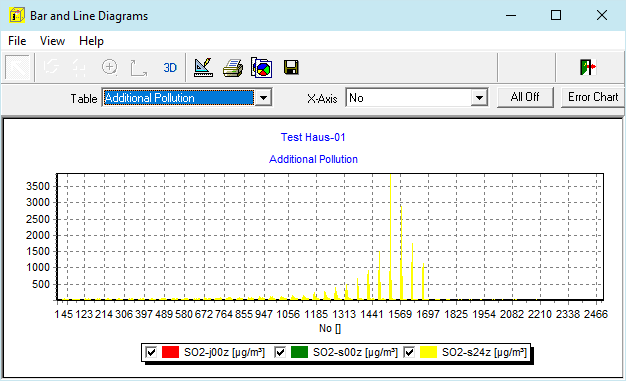
In this form bar charts over the different input and result tables can be produced. The selected table is being processed by rows. The Real columns are represented over the selected x axis. The time line represented above is only one example of many.
Table
Selection of the table to be used.
X-Axis
Here one can assign a column to the x axis. If x-values occur multiple times, the resulting bars are drawn over each other.
All Off
Here all series can be switched off. This comes in handy, when dealing with a lot of series.
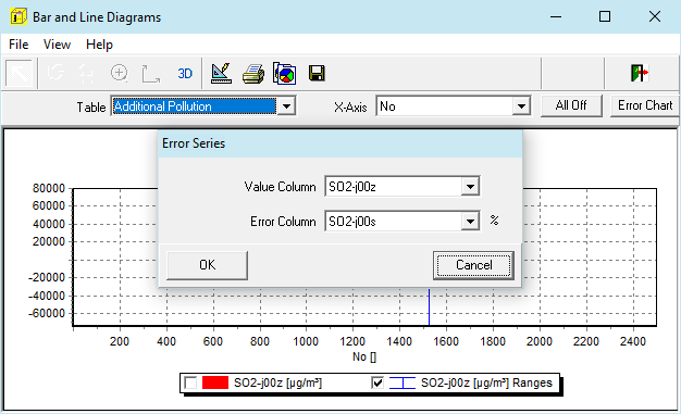
Error Chart
With this switch two value columns can be combined together to show ranges (example below). In the example NO2-j00z and NO2-j00s were selected. One of the columns must have the unit %.
If there are many elements in the legend, it can occur that the elements can only be switched slightly above the check box.
Also see: Operation within the graphics